In high school art you spend a lot of time making color wheels, drawing fruit and trying to remember the differences between value and intensity (I really struggled with that for some reason.) Like a good student I dutifully memorized all the basics of color theory and could employ them; but I didn’t really explore it further. Flash forward and I’m on the floor of my studio staring at all of the supplies I’ve spread out across the floor and thinking “Ive got nothing”. Not a single material sparked any sort of idea or curiosity. I was ready to give up and go watch the new Dungeons and Dragons movie for the tenth time when I had one last idea. I grabbed a random piece of fabric out of the pile and spread it out in front of me. There was my challenge: find things that will make this fabric look amazing; a basic exercise in color. I was feeling really ambitious, I wanted to reach Van Gogh levels of color mastery here! It didn’t work out that way but I did discover a greater appreciation for color theory.

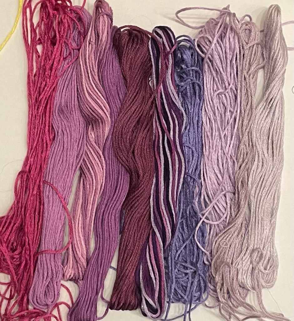
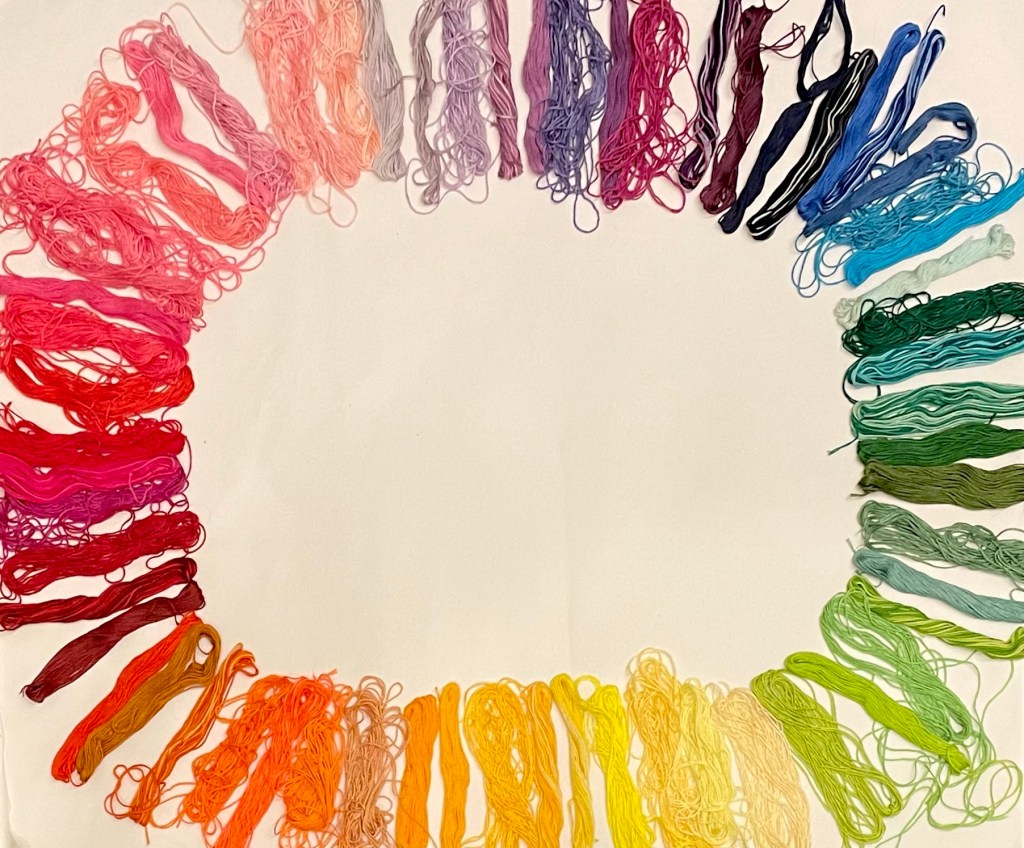
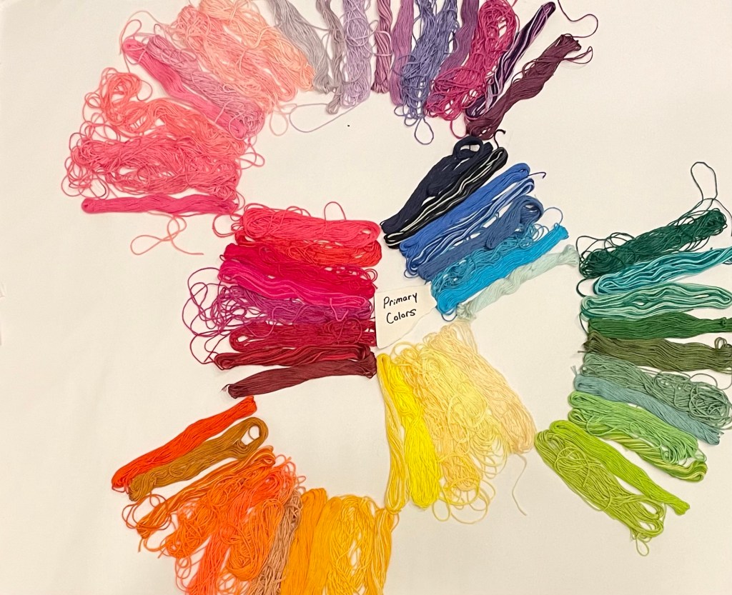
Because I needed to be able to see all of the color combinations I had at my disposal; I decided to lay out all of my embroidery threads in front of me, those were my colors. (Please don’t judge me for the terrible state of my skeins) I eventually created a color wheel out of the skeins of thread and put the fabric directly in the middle. Personally I think it was a masterpiece, each and every option available and comparable all at once! How very obsessive compulsive of me. Creating this epic color wheel is when my relationship with color changed. I’d already sorted by hue next would be putting the colors in a proper order- light to dark, aka Value. For each color I laid them out: petal pink to fire engine red, pale blue sky to starry night.
It felt like I was still constantly re-sorting my colors. I realized that I had been paying too much attention to value (the amount of lightness and darkness a color has) and forgot to consider Intensity. (The brightness or fullness of a color). I arranged the colors in a very specific order: eyes wide open to fully closed. When your pupil is completely dilated from the light, that is when you will see the highest intensity, white tones of a color. As the eye closes, less light reaches your eye. So the colors slowly become more muted and eventually dark-to-black. I was actually experiencing color theory in action each time my eyes opened and closed! Now that I had my colors as close to sorted as I could make them (It was a lot harder than I’d like to admit) I could explore and compare complementary colors, analogous colors, warm colors, cool colors, etc, etc. I’m a very tactile person, so to be able to see the colors and compare them while also being able to touch and interact with them was amazing.
When you consider warm and cool colors, your mind is likely to be drawn to very specific things. Warm, hot, fire. Cool, Ice, Water. You also likely associate these colors with temperature based on touch, or from our societal expectations of a color. So much context in each and every color. I really find that aspect of color theory fascinating, definitely worth further exploration.
So that was my night, a color theory deep dive that I hadn’t expected or intended. I declare myself a (still very much in progress) color theory nerd. If you found any of this as interesting as I do and want more in depth explanations of theory and explorations of color and culture, I recommend: “The Secret Lives of Colors” and “The Anthropology of Turquoise”.


Leave a comment